Home365 project
Owner dashboard

What is Home365?
Home365 is an Israeli property management company specializing in U.S. properties. Its services offer significant cost and stress reduction for property owners.

The problem
Our current property owners had been using the same dashboard UI for several years, with an outdated design that no longer aligned with the needs of its users.
The challenge
As part of the work process, the interviews were conducted only with our property managers, so we had to gather additional insights from other sources.
The projects goal
Creating an intuitive and accessible dashboard for our property owners.
1
Modernize the dashboard
Making it more user-friendly,
visually appealing, and aligned with current design trends
2
Enhancing usability
Make it easy for users to find what they need and explain the meaning of data points
3
Keep the owners updated
Providing owners the most critical data in a timely manner.
It should be relevant for LLCs and for individuals
DEFINING THE PROBLEM
Flow analysis
I started with understanding the most valuable portal assets and the actions that owners need to take care of starting from the sign-in page.
1
Owner signs into the portal

2
Owners registered to the basic plan are initially directed to the "Income Guarantee" page instead of the dashboard.

3
Owner clicks on the dashboard section in the menu

4
Owner clicks on the "See 1 more" next to the alerts section

User session analysis
I was curious about how owners were interacting with the current dashboard, so I began reviewing numerous Hotjar recordings to better understand the problematic areas that needed attention.

Here’s what I discovered based on the Hotjar recording:
Expectations Vs Reality
Users tend to click on the "Annual view", "Current cash flow balance", and "Income" sections, multiple times, but unfortunately, these elements are not clickable.
Disregarding alerts
Users may dismiss alerts for later attention, but once closed, they are no longer shown in the alert section.
Problems for owners
1
Unintuitive flow
Landing on a page other than the dashboard when entering a management portal can be confusing and unintuitive. Moreover, users often overlook promotional elements, particularly when they are presented immediately upon entry.
2
Extra steps for completing actions
Currently, the only way to view the hidden alerts is to open the pop-up when clicking on the "see 1 more". Concealing these alerts increases the likelihood that owners may miss important actions that we need them to do.
3
Clickability issues
Users repeatedly click on non-clickable elements expecting them to navigate to other pages, it can lead to frustration and dissatisfaction with the platform.
Problems for business
1
Decrease in user engagement
Inefficient navigation and unclear UI elements can slow down owners’ ability to manage their properties, reducing their productivity.
2
Lost revenue
Dissatisfied owners may switch to competitors, leading to increased churn and revenue loss.
SOLUTION
Design for more intuitive use
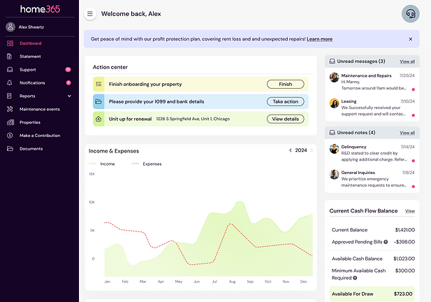
Remove the "Income Guarantee" from the menu and replace it with a promotional banner at the top of the dashboard.

Explanation
The new banner is an eye-catching element designed to boost owner engagement.
It will display various promotions tailored to the owner's plan and status.
Entering promotion page will be solely available from this banner.
Design for less interaction cost
Create a prominent action center that will display the main owners' actions straight away
Explanation
All actions will now be prominently displayed to the user, with each action differentiated by a distinct color. If only one request exists within a category, clicking on it will open a side bar with the relevant action. If there are multiple requests in a category, the CTA will include a dropdown for further options.
Design for more transparency
Add 2 new sections for unread messages and notes.


Explanation
The need to create these new elements instead of relying on the menu notifications arose because owners often miss notes directed to them and responses to their submitted tickets.The decision to add two separate sections stems from the fact that each one leads to a different page.
Design for meeting expectations
Adding CTAs to every section that will lead to relevant pages

Explanation
The new "View" links in nearly every section are intended to boost user engagement and make it easier for users, which already expecting the sections to open.


